

")
It is commonly believed that if the temperature significantly and durably changes on a given place on the planet then the prevalent climate in that region will also durably change. This is why all considerations about climate are centred on temperature changes.
Temperature is an intensive property of matter; its value does not depend on the system size or on the amount of material in it. The temperature changes when energy is brought into or drawn from a given system.
On earth the atmosphere is not perfectly and instantaneously mixed: there is no valid way to define an average temperature at any altitude, although 288 K (15°C) is often used as mean surface temperature for approximate calculations [1]. Also, there are daily maxima and minima and a high variability during, between, and across seasons.
So, how to detect small but steady temperature increases or decreases behind a forest of large variations? What is possible to do is to evaluate so called anomalies: a given observation at a given place may be compared with the average of measurements made at that same location for a reference period of time. The difference between the current measurement and the average during the reference period is called anomaly.
![]()
The anomalies from well distributed locations around the World can be grouped and, again, averaged [2]. This is what has been done by the Met Office Hadley Centre in the UK, on the behalf of the Intergovernmental Panel on Climate Change (IPCC). The dataset HADCRUT4 for land and sea surface can be downloaded at www.metoffice.gov.uk.
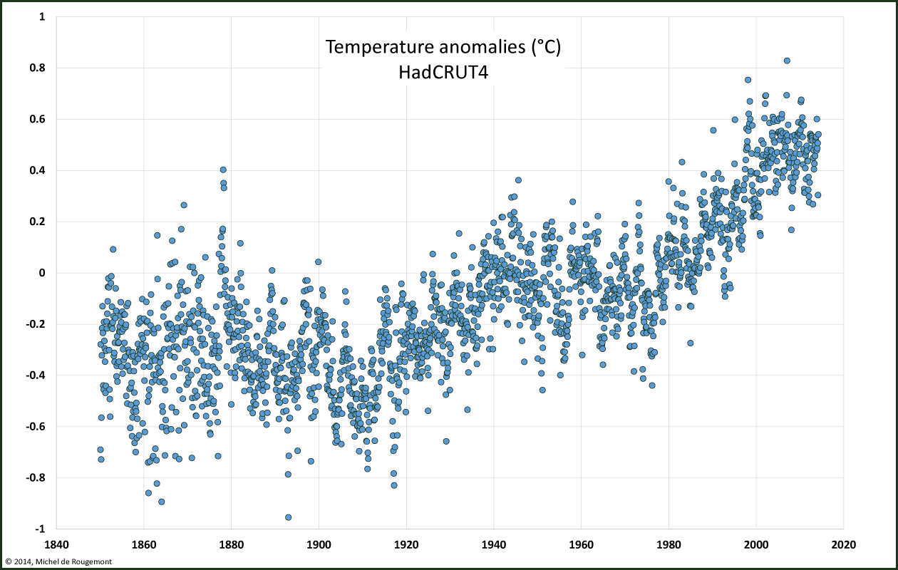
Global monthly surface temperature anomalies in °C with relation to average 1961-1990. Dataset HADCRUT4.
This kind of dataset has been criticised, in particular the selection of the measuring stations. Historically, most temperature records were made on land in the Northern hemisphere, in Europe and North America. The dataset is less abundant in the Southern hemisphere and on sea surfaces.
Also, measurement stations are mostly situated in or near urban areas, where people are interested to know more about their local weather.
This may imply a bias to more positive readings since such stations are not free from the warming interference with surrounding constructions such as buildings, asphalted areas, etc..
With its high short term variability it is difficult to make use of the data for long term analysis. There are two ways to reveal a trend that may lie behind a series of more or less chaotic individual reading.
One is to calculate running averages over the past n periods in order to attenuate sudden and unique variations; the value is then centered in the middle of the period n.
Or, to take into account repeated seasonal variations, the monthy average of each month of the year can be calculated over a running period of n years. This enables distinguishing between seasons instead of aggregating them in a classical running average. This trick is of my invention: no site from public or private origin is showing monthly data series in that way; I’m wondering why.
In a time frame covering the mid of the 19th century to present, two rising periods (1910-1945 and 1978-2003) clearly alternate with slightly decreasing ones. Since the end of the past century, no statistically significant increase could be measured.
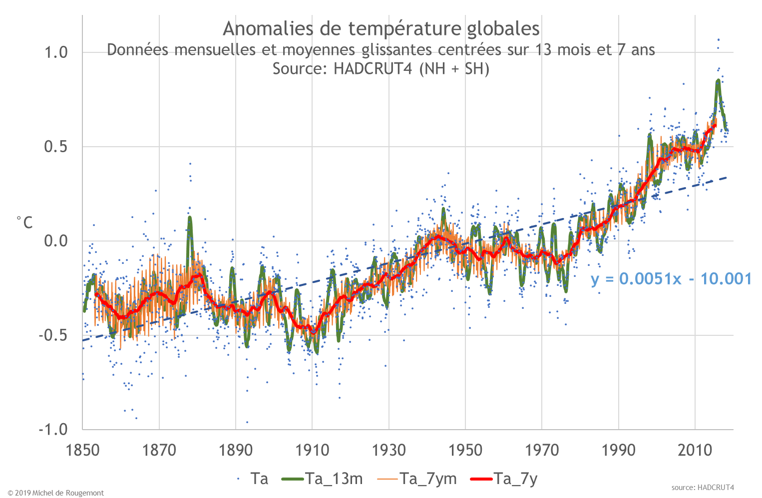
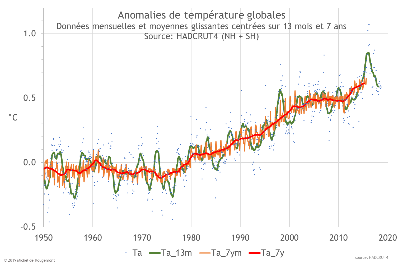
The 7 year monthly avarage (in red) is better seen on a closer time span where it looks smoother than the 13 months running average (in blue) and shows the evolution of yearly maxima and minima.
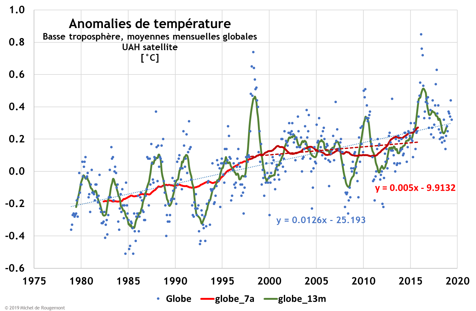
Since 1979, satellites are monitoring global temperature variations. This has the advantage to be independant of the quality and location of weather stations, and also to cover maritime zone where measurement have been scarce. here are the most recent data (Source: University of Alabama), smoothed in various ways:
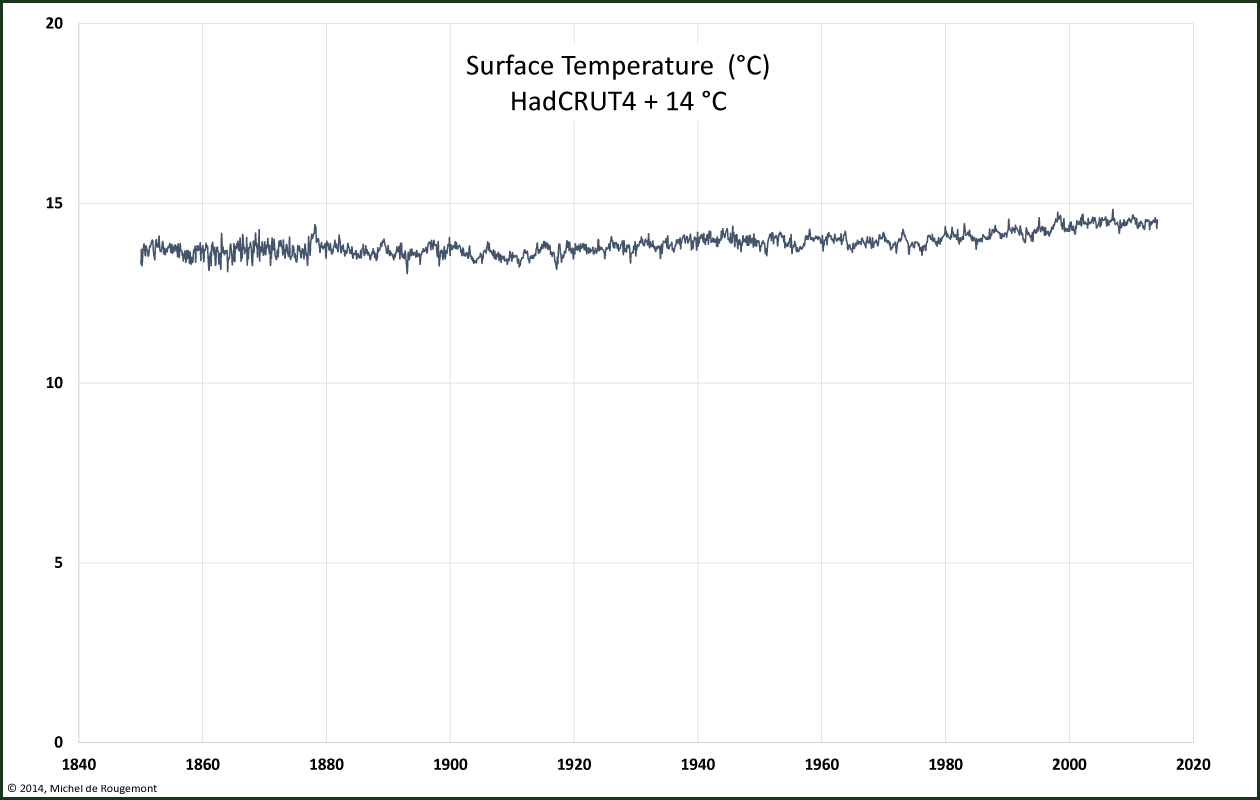
Very small differences are made visible with temperature anomalies. However, one should remember that temperature is an absolute dimension related with the energy content of the system. Seen on its full scale (here in °C, assuming a mean value of 14°C) the same graph looks much more stable:
Warming can also be expressed as the rate of increase of the temperature anomalies, in °C per century. To detect a trend it is necessary to apply a filter, over 7 and 31 years on the following diagram.
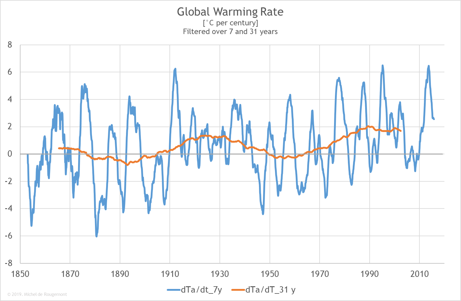
An accelerating trend is noticeable, as well as an oscillation with a period of approx 60 years.
Earlier history
For earlier time series the uncertainties are quite high since no actual measurements could be made. Proxies such as tree ring analyses were used. The famous hockey stick representation was made by Mann et al. in 1999. Since heavy data massaging is required to obtain such diagram, an on-going controversy about data handling is still unresolved, even in courts of justice.
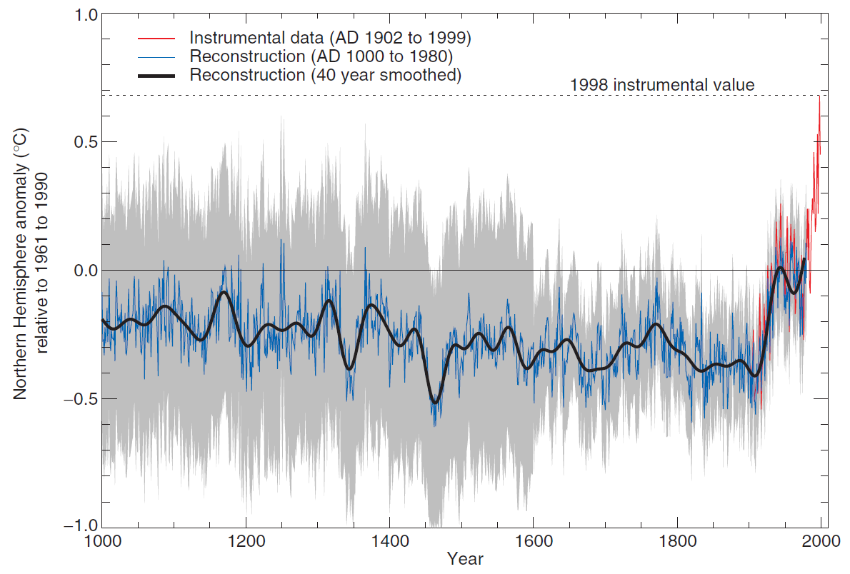
The Hockey Stick. Original estimate published by the IPCC in 2001
But 13 years later, in its 5th assessment report [3], the Intergovernmental Panel on Climate Change (IPCC) gives a slightly different interpretation of climate over the past two millennia, taking distance from Mann’s interpretation of tree rings.
These are examples in which facts are not always that clear: raw data need interpretations and statistical analysis which can lead to different conclusions, such as:
- never was the temperature as high as today in the past millennium;
- in recent history the earth has already experienced positive temperature anomalies similar to the present ones (warm medieval period), as well as negative ones such as the “little ice age” during the 16-18th centuries, as shown on the next figures.
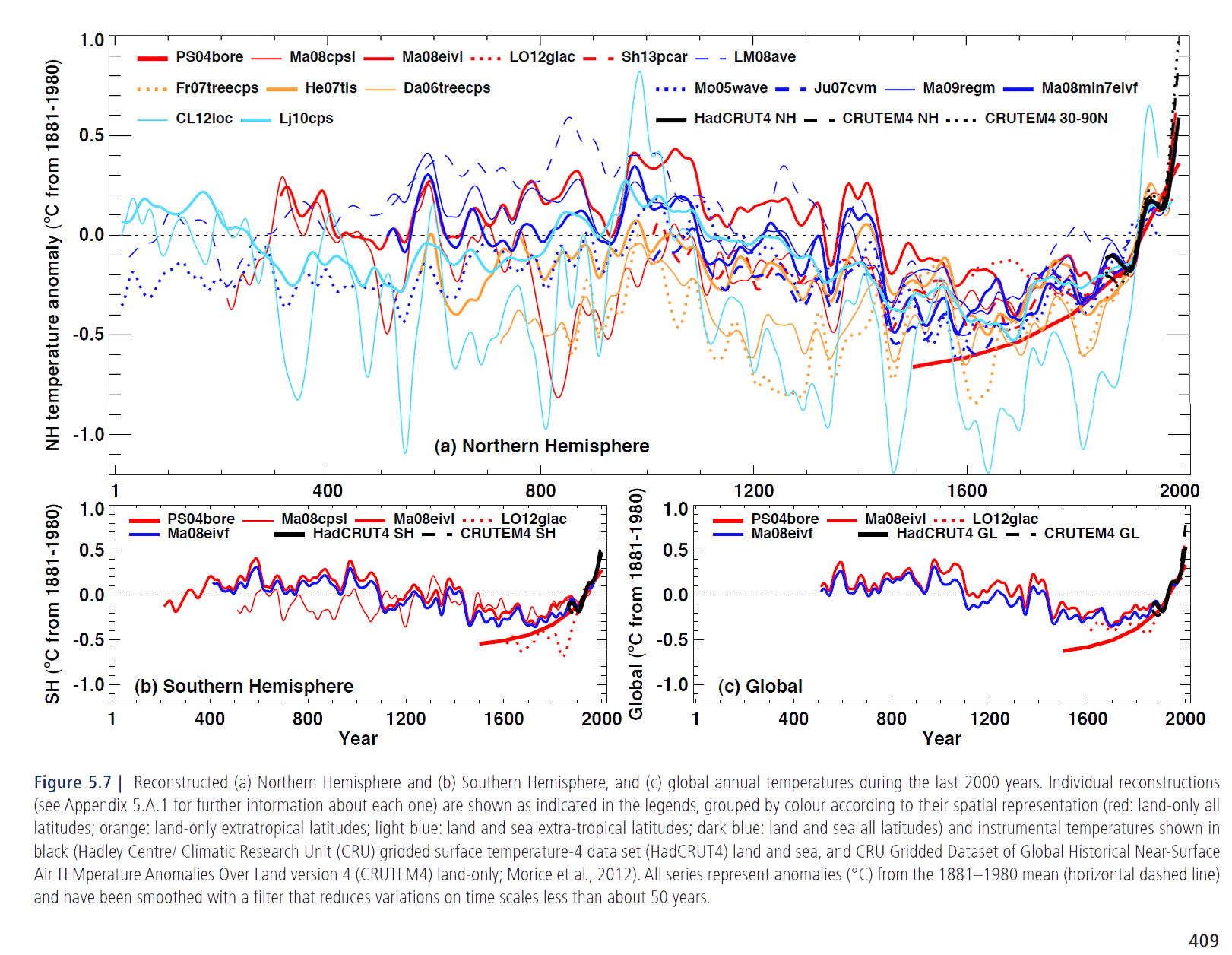
Temperature anomalies reconstructed. IPCC AR5 report, Chapter 5.
Note that the diagrams stops at 2000, thus not showing the interruption of the temperature increase since then, although the report was written in 2013.
The climate experiences by our ancestors in Europe has been described in the literature. Periods of warmth and cold are shown in the following reconstruction; coincidence with historical events is left to the imagination of the reader.
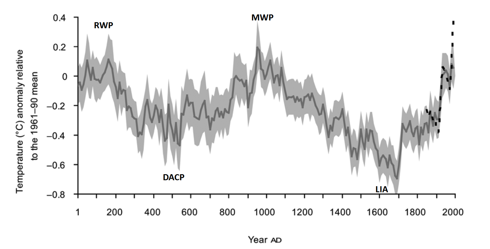
Roman and Medieval Warm Periods, Dark Age Cold Period and Little Ice Age in the extra-tropical Northern Hemisphere. Source: Ljundgquist [4]
Lapse rate
At the surface of the earth, the temperature is on average approx. 14 °C. When we fly in an airplane we learn that at an altitude of 10’000 m the temperature is around -50°C. This temperature gradient is called lapse rate.
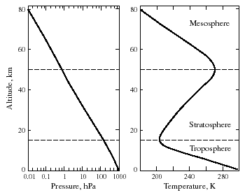
Pressure and temperature of the atmosphere vs. altitude at 30 °N latitude in March
Source: acmg.seas.harvard.edu
This is explained by the reduced pressure at high altitude (down to vacuum in the outer space): the temperature of an expanding volume of air will fall, as no heat exchange is taking place with the surroundings (adiabatic conditions). In the troposphere, for every 100 m elevation, dry air will cool by approx. 1 °C, and air saturated with water vapour has a lapse rate of approx. 0.5 °C/100 m. Humid air behaves differently than dry air because, at cooling, some of the water will condensate (and form clouds), releasing heat that partially compensates for the adiabatic temperature decline.
In the next atmospheric layer, the stratosphere, the temperature is increasing again. This is caused by the absorption of ultraviolet sunlight and by the accompanying physicochemical reactions taking place with UV light, oxygen and nitrogen.
The temperature gradient is again negative in the mesosphere.
Sea water temperature
Sea water temperature is the result of complex phenomena: it warms up when heated by the sun and by warm air, and cools down when exposed to cooler air or when water evaporates, as favoured by wind. Also, vertical transport takes place due to density differences linked with the temperature itself (cooler water is denser), and the change in salt content resulting from dilution by rain, or from concentration by evaporation (more salty water is denser).
Evaporation implies much more energy than heat exchange by convection or conduction. This makes sea surface temperature a quite important, but difficult to interpret parameter.
The heat capacity of water is roughly 4 times larger than that of air; and water is thousand fold denser than air. This means that the whole atmosphere has the same heat capacity as a 3.4 m deep ocean layer. Therefore, seas constitute a huge heat reservoir in which the detection of temperature change of one thousandth of a °C may be as significant as 1°C in the atmosphere. But in this respect, one shall remember that precisely measuring temperature with an accuracy of ±0.02 °C is no simple task. This complexity means that monitoring pictures like the one of Figure 10 are spectacular but may not allow for accurate interpretation.
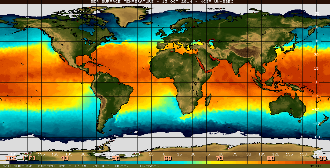
Sea Surface Temperature on June 23, 2014. Source: www.ssec.wisc.edu/data/sst/
Since 2000, monitoring floats measure temperature and salinity at various depths all around the World. As of 2014 there are 3200 such autonomous floats that record and send profiles similar to the figure on the left. Since these floats are freely deriving in oceanic currents, the concept of temperature anomalies comparing time series of temperature measurement at the same place cannot be applied. |
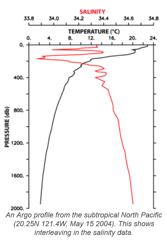 Argo Float Profile. Source: www.argo.ucsd.edu |
[1] When one bucket is filled with boiling water and another one with ice cold water, there is no way to pretend that the average temperature is 50 °C. If the content of these two buckets are mixed together, a water temperature of about 50°C can be expected for the mixture, but only if the water quantity was the same in both buckets.
[2] If one of the buckets is heated by 0.5 °C, and the other one by 1.5°C, the average absolute temperature will still be meaningless, but the mean temperature increase of 1.0 °C may be useful information about the thermal change of the system composed by the two distant buckets.
[3] The 5th Assessment report is available from the Working Group I.
Politically correct citation: IPCC, 2013: Climate Change 2013: The Physical Science Basis. Contribution of Working Group I to the Fifth Assessment Report of the Intergovernmental Panel on Climate Change [Stocker, T.F., D. Qin, G.-K. Plattner, M. Tignor, S.K. Allen, J. Boschung, A. Nauels, Y. Xia, V. Bex and P.M. Midgley (eds.)].
Cambridge University Press, Cambridge, United Kingdom and New York, NY, USA, 1535 pp.
Since this work has been paid for with public money, I’m authorizing myself to cite it and use it as I like.
[4] Ljungqvist, F.C. 2010. A new reconstruction of temperature variability in the extra-tropical Northern Hemisphere during the last two millennia. Geografiska Annaler Series A 92: 339-351.